Ten Minutes, Two Tabs: A Field Guide to Figuring Out If an App Actually Earns Its Spot on Your Phone
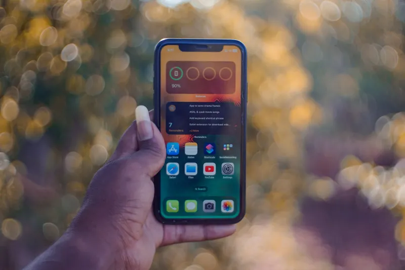
Every few months, I do something a little nerdy: I audit my phone. Not the photos, not the storage — the apps. Specifically, the social ones. And lately I've been using a simple question to sort them, one I've started calling the two-tab test.
It goes like this: can you use the app productively while doing something else in a second browser tab? If yes, it's a tool. If the app demands your full, undivided attention — if stepping away for thirty seconds means you've missed the moment — congratulations, you've downloaded a trap.
It sounds glib, but stick with me. The distinction matters more than it used to.
Why the Tool vs. Trap Line Matters
Tools respect your time. A good messaging app, a neighborhood group board, a professional networking space — these are things you use, then put down. You get value and leave. Nobody feels guilty about closing Google Maps.
Traps, on the other hand, are engineered around a different goal: maximizing the minutes you spend inside them. The infinite scroll, the autoplay, the red badge that never quite clears — these aren't design accidents. They're engagement metrics wearing a friendly avatar.
The problem is that the line between the two has gotten blurry. Plenty of apps started as tools and quietly grew trap features. Your group chat app now has stories. Your professional network now has a video feed. Somewhere along the way, "connect smarter" became "connect longer."
Running the Test: A 10-Minute Checklist
Pick any app on your phone and give it ten honest minutes. Score it on these five questions:
1. The two-tab check. Open the app next to a work doc or a recipe. Can you glance over, handle a message or post, and return? Tools survive this. Traps pull you back in with a freshly loaded feed you didn't ask for.
2. The open-with-intent test. Open the app with a specific task: reply to one person, find one event, check one notification. Did you accomplish it? Or did you surface eleven minutes later with no memory of the task?
3. The closing cost. When you hit the back button or swipe away, does the app let you go gracefully? Or does it hit you with a "are you sure?" modal, a streak warning, or a feed strategically positioned where the exit used to be?
4. The value-after math. After a week of use, what do you have to show for it? A new collaborator, a booked coffee chat, an answer to a real question? Or just a vague sense of having been around?
5. The notification autopsy. Go into your settings and look at what the app sends you. Tools notify you about things you care about. Traps notify you about you — "someone viewed your profile," "you have 3 new likes waiting."
Score four or five out of five? Keep it. Two or fewer? You've got a decision to make.
What This Looks Like in Practice
I ran the checklist on a handful of apps I use, including our own platform, because holding yourself to your own standard is the only way this framework means anything.
A good networking-first platform — and this is the bar we set for OranSNS — should pass the two-tab test easily. You drop in, respond to a thread, follow up with someone you met at a meetup in Austin or a coworking space in Chicago, and get out. The value compounds in your actual network: the intro that turns into a job lead, the group that turns into a side project. That's utility. That's a tool.
The trap version of the same app looks identical on the surface. Same profile, same connections. But somewhere in the settings, there's a feed tuned to keep you watching, and the notification strategy reads like a clingy text from an ex.
What the Design Community Says
This isn't just a consumer gripe. A growing chorus of product designers has been pushing back on engagement-at-all-costs development. The argument, in short: when time-in-app is the north star metric, every design decision bends toward keeping you — and utility loses to compulsion every time.
The alternative gaining traction in smaller product teams is sometimes called "calm by default" design: no infinite scroll where a chronological list will do, notifications that default to off, and success measured by whether users accomplished something, not how long they lingered. It's the difference between a good waiter and a busboy who refills your glass so you can't leave.
Some of the big platforms are experimenting with this too — usage dashboards, take-a-break prompts — though skeptics rightly note that a platform asking you to leave less often than it asks you to stay isn't exactly a reformed character.
The Bottom Line
Your phone's home screen is prime real estate, and you're the landlord. The two-tab test won't settle every debate — some genuinely great apps have addictive edges, and some useful ones deserve a bit of your attention. But it's a fast, honest gut check in an industry that profits from you never asking the question.
Run it this week. Ten minutes, five questions, one honest score. And if an app fails? Delete it without ceremony. There's a better tool out there — one that connects you smarter instead of just connecting you longer.