The 187-Person Inner Circle: Why Your Social App Needs a Third Door

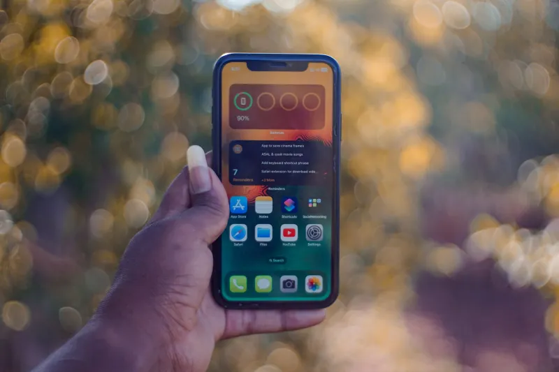
Photo: MaheshBaruahwildlife, CC BY-SA 4.0, via Wikimedia Commons
Open your favorite app. Tap the close friends list. Count the names.
I did this last week and got 187. Not 18. Not 87. One hundred and eighty-seven people are apparently in my innermost circle, which means either I'm living a sitcom-level social life or the word "close" has quietly stopped meaning anything.
That's not a personal failing. It's a design failure—and it's one of the most fixable problems in social software right now.
How "Close" Became a Crowd
When Instagram introduced Close Friends back in 2018, the pitch was simple: a smaller audience for the stories you'd never post to everyone. A green ring. A private room. For a while, it worked.
Then the feature got popular, and popularity has a way of bending things. Adding someone to your close friends list became a polite gesture—a digital nod, a way of saying "you're in" without ever really meaning it. Somewhere between the wedding party, the college group, the work folks you actually like, the neighbor with the good dog, and the guy from your fantasy league, the list ballooned. Suddenly the private room had a guest list longer than a suburban graduation party.
And here's the kicker: everyone knows it. When you post to close friends now, you're not whispering to your inner circle. You're performing for a semi-public audience that happens to have a green ring around it. The stakes feel lower than a public post, but they're not low. They're just confusing.
The Anxiety Tax of a Semi-Private Stage
This is the part social apps keep underestimating: ambiguity is expensive. When users aren't sure who's watching, they don't post more. They post less, or they post something safe, or they DM the actual close friends instead.
Think about the mental math before a close-friends story. Is my boss on this list? Did I add my cousin after that reunion? Will my sister see this and ask why she wasn't on the list for the other thing? That's not sharing. That's a group project.
The result is a weird hybrid space—too private to be casual, too public to be honest—and a whole generation of users quietly opting out. They post to the main feed, or they send a photo to four people in a group chat, or they just lurk. None of those behaviors are bad. But they aren't what the feature promised, either.
Three Doors, Not Two
Most social apps give you two options: everyone, or a hand-picked list. That's a binary, and real friendship doesn't work in binaries. Ask anyone who's planned a dinner party.
What users actually need is a third door:
- The front porch (public). Anyone can see it. Great for announcements, jokes, and the kind of content you'd be fine with a future employer finding.
- The living room (trusted circle). A mid-sized group you've chosen deliberately. Not everyone, not your inner five. Maybe 30 to 75 people—the folks you'd invite to a backyard barbecue.
- The kitchen table (capped inner circle). A hard limit. Ten, fifteen, twenty people max. The app won't let you add more, and that's the point. Scarcity creates honesty.
The magic isn't in the labels. It's in the cap. A capped tier forces a decision, and decisions force clarity. When you know exactly who's in the room, you know what to say.
What the Middle Tier Looks Like in Practice
Design details matter here. A few principles that separate a real community feature from a checkbox:
Make the audience visible before the post, not after. A persistent chip or banner that names the tier—"Posting to: Kitchen Table (12 people)"—removes the guesswork. No one should have to remember who made the cut.
Respect the cap. If the inner circle is capped, don't let users slide around it with a second list, a secret alias, or a workaround. The constraint is the feature.
Show reciprocal context where it's safe. Knowing that someone also considers you part of their inner circle can be a small, powerful signal—but it should be opt-in, not a leaderboard.
Let people leave gracefully. Removing someone from a tier shouldn't feel like a breakup notification. Silent updates, no drama. The best social tools are quietly humane.
Default to the middle. Most posts don't need to go to everyone and don't need to go to five people. The living room should be the easy choice, not the hidden one.
Why This Matters for the Sign-Up Funnel
There's a business case buried under all this etiquette. The first five minutes of a social app are usually a nightmare of toggles and permissions and "find your friends" screens. Users bail because they don't yet know what the place is for.
A clear tier system changes that. Instead of asking new users to "follow everyone," you can ask a better question: who are the ten people you'd actually want to hear from this week? That's a short, answerable prompt. It builds a real graph, sets expectations, and signals that this app understands context.
At OranSNS, that's the version of connectivity we're interested in—smaller graphs, clearer rooms, fewer accidental audiences. Signing up should feel like being handed keys to a place, not a ticket to a stage.
The Takeaway
Nobody needs another list of 187 names. What people need is permission to be honest with a small group, and a product that makes the small group feel safe rather than ceremonial.
So here's the challenge to every social app shipping a close friends feature in 2026: stop asking who's close. Start asking who's in the room. Then design the room so people actually want to talk.